To go beyond basic color psychology, focus on how saturation and brightness shape emotions and perception. Consider cultural meanings, as colors differ worldwide in symbolism and impact. Use warm and cool tones strategically to create depth, mood, and atmosphere. Experiment with complementary and analogous schemes to evoke energy or harmony. Pay attention to context, environment, and gradients, as these subtle shifts influence viewer feelings. Explore these nuances further, and you’ll deepen your ability to craft emotionally resonant artwork.
Key Takeaways
- Leverage saturation and brightness to evoke specific emotions and create visual depth through layering and contrast.
- Incorporate cultural color meanings to ensure your artwork communicates appropriately and resonates with diverse audiences.
- Use warm and cool tones strategically to influence viewer mood, depth, and atmosphere in your compositions.
- Experiment with unconventional color combinations to stimulate curiosity and emotional engagement beyond traditional palettes.
- Adjust ambient lighting and environmental context to enhance or modify the psychological impact of your color choices.
The Subtle Power of Color Saturation and Brightness
While color saturation and brightness may seem like minor details, they wield significant influence over how your artwork communicates and evokes emotion. Monochrome contrast relies heavily on saturation dynamics to create depth and focus. By adjusting saturation levels, you can highlight specific elements or convey mood; vibrant hues evoke energy, while desaturated tones suggest calm or somberness. Brightness impacts the overall atmosphere, setting the tone of your piece. Subtle shifts in these variables can dramatically alter viewer perception without changing the color itself. Mastering saturation and brightness allows you to craft nuanced visual stories, guiding emotions and attention seamlessly. Recognizing how these elements interact empowers you to use color intentionally, making your artwork more compelling and emotionally resonant. Additionally, understanding the psychological effects of color saturation and brightness enables you to connect more deeply with your audience and evoke targeted emotional responses.
Cultural Influences on Color Perception and Meaning
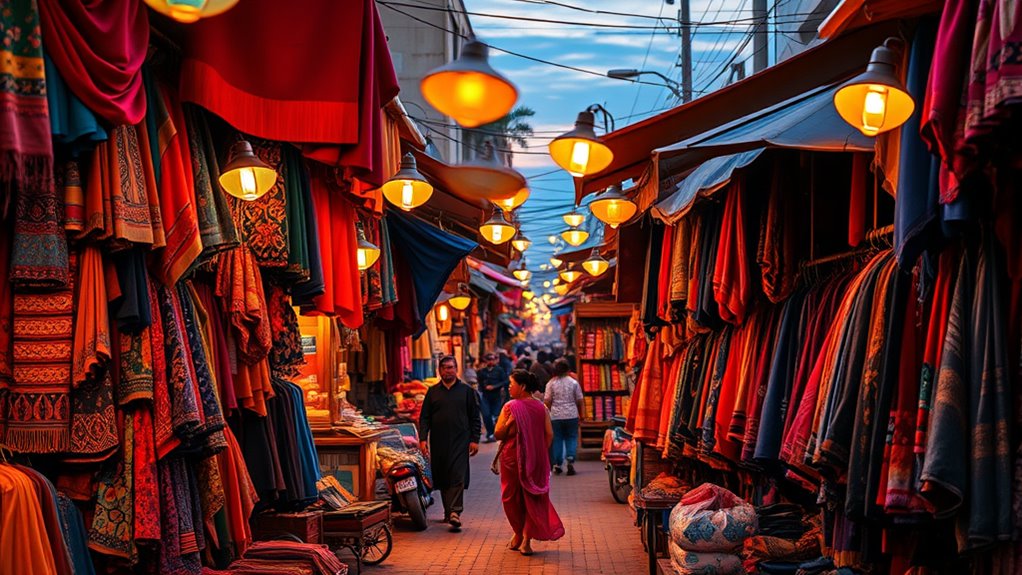
Your understanding of color changes when you consider cultural symbolism and regional differences. Colors can convey different meanings across cultures, affecting how your artwork is received. Recognizing these variations helps you create more impactful and respectful pieces. Incorporating cultural influences on perception into your color choices ensures your artwork resonates appropriately with diverse audiences.
Cultural Color Symbolism
Cultural backgrounds deeply influence how people interpret and assign meaning to colors. Recognizing cultural color symbolism helps you connect more authentically with diverse audiences. Different cultures attribute unique emotions and values to colors, shaping cross cultural color meanings. For example:
- Red can symbolize luck and prosperity in China but danger or warning in Western contexts.
- White often represents purity and peace in Western traditions, yet mourning in some Asian cultures.
- Black signifies elegance in fashion but grief in many societies.
Understanding these variations enables you to evoke specific emotions and avoid misunderstandings. When choosing colors for your artwork, consider the cultural context of your audience. Incorporating cultural influences into your color choices can deepen the emotional resonance of your work and foster greater cross-cultural understanding. This awareness enriches your work’s emotional impact and ensures your message resonates across cultures. Mastering cultural color symbolism elevates your artistic storytelling.
Regional Color Variations
Regional differences substantially shape how colors are perceived and valued across various parts of the world. These variations create unique regional palettes influenced by local pigments and natural resources. For example, certain hues might be abundant and affordable in one area, shaping a community’s artistic choices, while others are rare and signify luxury or importance. You’ll notice that traditional dyes derived from local pigments give each region its distinct color signature. These regional palettes reflect environmental factors, trade history, and cultural priorities. Understanding these differences helps you appreciate how colors carry specific meanings within different contexts. For instance, the availability of local pigments directly impacts the color choices and aesthetics of regional artwork. When working on international projects, consider how local pigments and regional color preferences influence your audience’s perception and emotional response. This awareness enhances the authenticity and resonance of your art across diverse cultures.
Cross-Cultural Interpretations
Colors carry meanings that extend beyond regional palettes, shaped by deeply rooted cultural beliefs and practices. When exploring cultural color symbolism, you’ll find that perceptions vary widely across societies. For instance, in some cultures, white symbolizes purity and peace, while in others, it signifies mourning. Understanding regional color variations helps you avoid misinterpretations and connect authentically. To evoke emotion and respect cultural nuances, consider these:
- Recognize that red can signify luck in China but danger in Western contexts.
- Use blue thoughtfully, as it often represents trust but can also imply sadness.
- Be aware that black may symbolize elegance or mourning depending on the culture.
- Additionally, life cycle analysis indicates that the environmental impact of color-related practices can differ across regions, influencing how colors are used sustainably.
Color Temperature and Its Emotional Impact

Understanding color temperature is essential because it influences how viewers emotionally respond to your artwork. Warm colors, like reds, oranges, and yellows, evoke feelings of energy, passion, and warmth. They can create a sense of excitement or urgency, making your piece feel lively and inviting. Cool colors, such as blues, greens, and purples, tend to induce calmness, serenity, and sometimes sadness. The emotional impact of color temperature helps you guide viewers’ moods and reactions, shaping their experience of your work. By consciously choosing warm or cool tones, you can enhance the message or atmosphere you’re aiming to communicate. Recognizing how color temperature affects emotional response allows you to craft more powerful, emotionally resonant art that connects with viewers on a deeper level. Additionally, understanding the emotional influence of colors can help you develop a more intentional and impactful artistic style.
The Role of Complementary and Analogous Color Schemes
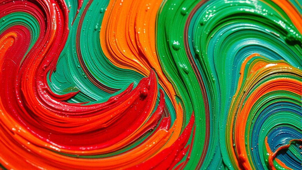
Choosing the right color scheme can dramatically influence the harmony and visual impact of your artwork. Complementary and analogous schemes are powerful tools to create effective color harmony and striking visual contrast. Complementary colors, opposite each other on the color wheel, evoke strong emotions and make elements pop. Analogous schemes, next to each other, produce a harmonious and soothing effect. To harness these schemes:
- Use complementary colors to energize your composition and draw attention to focal points.
- Blend analogous colors for a unified, calming mood.
- Balance both schemes to enhance emotional depth and visual contrast without overwhelming the viewer.
Using Color to Create Depth, Mood, and Atmosphere

You can use warm tones to bring elements forward and cool tones to push others back, creating a sense of depth. Adjusting color saturation can also influence mood, with more saturated colors feeling lively and vibrant. Layering colors thoughtfully helps build atmosphere, making your artwork feel immersive and dynamic. Incorporating color contrast techniques can further enhance visual interest and depth in your compositions.
Warm vs. Cool Tones
Warm and cool tones are powerful tools for artists to shape the mood, depth, and atmosphere of their work. By understanding how these tones influence color harmony and emotional resonance, you can craft more compelling pieces. Warm tones like reds, oranges, and yellows evoke energy, passion, and intimacy. Cool tones such as blues, greens, and purples create calm, distance, or melancholy. To effectively use them, consider these approaches:
- Use warm tones to draw attention and evoke excitement.
- Incorporate cool tones to establish tranquility or mystery.
- Balance warm and cool tones to deepen emotional resonance and guide viewer engagement.
- Understanding Asset Division laws can help artists navigate legal considerations when selling or sharing their work, especially if involved in collaborative projects or licensing.
Mastering warm vs. cool tones allows you to control the emotional journey your artwork takes viewers on, enhancing the overall impact.
Color Saturation Effects
Color saturation plays a essential role in shaping the depth, mood, and atmosphere of your artwork. By adjusting color saturation, you control how intense or muted your colors appear, directly influencing the visual impact. High saturation creates vibrant, energetic scenes that seem closer and more immediate, while desaturated colors evoke subtlety, calmness, or distance. For example, rich, saturated reds can evoke passion or urgency, whereas muted tones suggest tranquility or melancholy. Using saturation strategically helps you guide viewers’ eye and emotional response, adding depth without relying solely on shading or perspective. Experimenting with saturation levels allows you to craft atmospheres that reinforce your intended mood, making your colors work more effectively to communicate your artistic message.
Layering for Depth
Layering colors is a powerful technique for creating depth and atmosphere in your artwork. By applying multiple layers, you can evoke emotion through subtle shifts in tone and contrast. Use monochrome contrast to emphasize depth, making foreground elements pop while background recedes. Incorporate color blocking to establish mood quickly—bold blocks create energy, while softer gradations evoke calm. To enhance your piece, consider these approaches:
- Build layers gradually, increasing contrast for focal points.
- Use monochrome shades to deepen shadows and add dimension.
- Overlay transparent glazes to infuse atmosphere and mood.
- Be mindful of skin sensitivity when choosing and applying colors and materials, especially if working with delicate or sensitive surfaces.
This approach allows you to manipulate visual weight and emotional impact, transforming flat colors into a compelling, layered scene. Mastering layering techniques for depth ultimately guides the viewer’s eye and enhances the story your artwork tells.
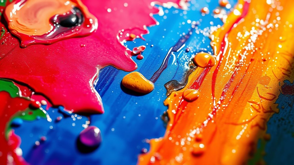
Psychological Effects of Unusual and Rare Color Combinations
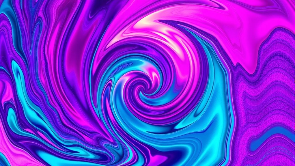
Unusual and rare color combinations can evoke powerful psychological responses because they challenge your expectations and stimulate curiosity. When you use unusual color pairings or rare hue combinations, you create a sense of surprise and intrigue in your audience. These combinations often evoke feelings of excitement, unpredictability, or even discomfort, depending on how they’re executed. For example, pairing a vibrant orange with a deep purple can feel energetic and bold, while combining pastel pink with neon green might feel unconventional and fresh. Such color choices can break visual norms, encouraging viewers to engage more deeply with your work. By intentionally selecting these rare hue combinations, you influence emotional responses and add a layer of complexity that draws viewers into your artistic narrative. Incorporating knowledge of cultural perceptions of colors can further enhance the emotional impact of your palette choices.
The Influence of Context and Environment on Color Interpretation
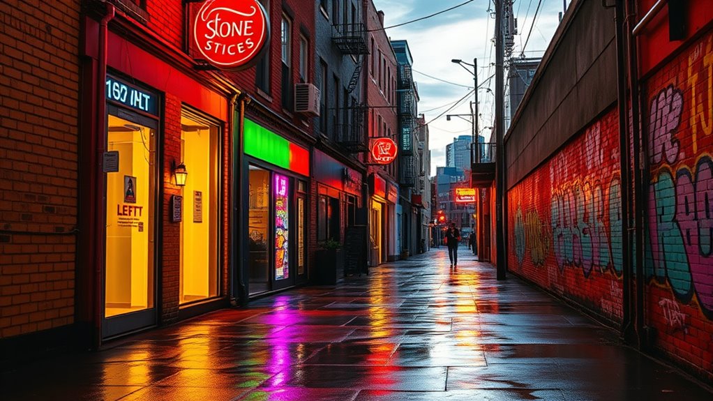
The environment surrounding a piece of art considerably influences how viewers interpret its colors. Ambient lighting can alter or enhance the mood, making colors appear warmer or cooler. Your viewer perspective also plays a role, as different angles may change color perception and emotional impact. To evoke specific feelings, consider these factors:
The surrounding environment shapes how viewers perceive and feel about an artwork’s colors.
- Adjust ambient lighting to complement or contrast your intended mood.
- Be mindful of how different viewer perspectives can shift color perception.
- Use environmental cues—like background colors or surroundings—to reinforce emotional messages.
Color Transitions and Gradient Techniques to Evoke Emotion

Colors in art don’t have to be static; how they shift and blend can considerably influence the viewer’s emotional response. Using color blending and gradient progressions allows you to create smooth shifts between hues, which can evoke feelings of calm, tension, or optimism. For example, a gradual transition from cool blues to warm oranges can convey serenity or hope, depending on context. Effective gradient techniques guide the eye seamlessly across your work, enhancing emotional depth. You can achieve this by layering colors gradually or blending them directly on your canvas or digital tool. The key is to control the flow of colors, making progressions feel intentional and harmonious. Mastering color blending and gradient progressions gives your artwork a dynamic, vibrant quality that deeply resonates with viewers.
The Intersection of Color and Symbolism in Visual Storytelling

As you incorporate colors into your artwork, understanding their symbolic meanings can deepen your visual storytelling. Color symbolism influences how viewers interpret your message and emotional impact. To evoke specific emotions, consider these key associations:
- Red — passion, anger, or urgency
- Blue — calmness, trust, or sadness
- Yellow — optimism, energy, or caution
Practical Strategies for Testing and Refining Color Choices

To guarantee your chosen colors effectively communicate your intended message, it’s important to test and refine them through practical methods. Start by creating small swatches or sketches to observe how colors interact, focusing on achieving color harmony that enhances unity in your work. Experiment with different combinations to see how they influence emotional impact. Pay attention to visual contrast; strong contrast can draw attention or create tension, while subtle contrast offers harmony and calm. Use tools like color wheels or digital apps to adjust hues and saturation easily. Step back frequently to view your work from a distance, ensuring your color choices support your composition’s overall message. Refining your colors this way helps you develop a confident, cohesive palette that resonates with viewers.
Frequently Asked Questions
How Does Individual Perception Affect Color Interpretation Across Different Viewers?
Your perception variability markedly impacts how viewers interpret colors. Cultural influences shape their emotional responses and associations with specific hues, so what feels calming to one person might evoke excitement in another. Personal experiences, mood, and even lighting conditions further alter perceptions. Recognizing this, you should consider diverse cultural backgrounds and individual differences when creating art, ensuring your work resonates broadly and communicates your intended message effectively across various viewers.
Can Color Choices Influence Viewer Behavior or Decision-Making Subconsciously?
You might not realize it, but your color choices can influence viewer behavior or decision-making subconsciously. Through color association, you activate subconscious triggers that evoke specific emotions or responses. For example, red can create urgency or excitement, while blue promotes calmness. By understanding these effects, you can craft art that subtly guides viewers’ feelings and actions without them even realizing it, making your work more impactful.
How Do Lighting Conditions Alter the Emotional Impact of a Color Palette?
Imagine you’re in a Victorian parlor, where lighting mood and color temperature set the scene. You learn that lighting conditions dramatically alter a color palette’s emotional impact—warm lighting emphasizes comfort, cool lighting evokes calm or detachment. When you adjust lighting mood and color temperature, your artwork’s emotional tone shifts, influencing how viewers perceive and feel about your colors. This awareness helps you craft more powerful, emotionally resonant pieces.
What Role Do Personal Experiences Play in Color Preference and Meaning?
Your personal experiences shape your color preferences and meanings through personal memories and cultural associations. When you see certain colors, they may evoke feelings tied to past events or cultural backgrounds, influencing your emotional response. You might favor warm tones because they remind you of happy memories, or prefer cooler shades linked to calmness. Recognizing these influences helps you understand why specific colors resonate deeply with you, guiding your artistic choices.
How Can Artists Effectively Use Color to Communicate Complex Narratives Visually?
You can effectively use color to communicate complex narratives by understanding color symbolism and cultural influences. Choose colors that resonate with specific themes or emotions, and consider how cultural meanings vary across audiences. Use contrasting or harmonious colors to highlight different story elements, guiding viewers’ interpretations. By thoughtfully combining these factors, you create visual stories that evoke deeper emotional responses and convey nuanced messages beyond simple aesthetics.
Conclusion
Harnessing the harmony of hue, saturation, and symbolism, you can craft compelling, mesmerizing compositions. By understanding cultural cues, climate cues, and clever contrasts, you create depth, drama, and desire. Remember, deliberate decisions drive dynamic designs. With delightful daring and dedicated experimentation, you’ll discover the dazzling power of color, transforming your art into an emotional, evocative experience. Embrace the endless exploration, and let your palette tell powerful, passionate stories that truly speak to your audience.