In August, don't miss the chance to refresh your home with vibrant color palettes. Warm hues like terracotta and mustard evoke late summer vibes, promoting comfort and relaxation. Earthy tones, such as soft greens and taupes, create soothing atmospheres, perfect for unwinding. You can energize your spaces with bold accents like deep greens or bright pinks, bringing life to neutral backdrops. Choose colors based on the mood you want in each room—warm for social areas, calming for bedrooms, and cheerful for kitchens. Explore unique combinations to elevate your decor, and there's so much more to uncover about this season's trends!
Key Takeaways
- Embrace warm hues like terracotta and mustard to evoke late summer vibes and enhance comfort in your home.
- Incorporate earthy tones like warm taupes and soft greens for a calming atmosphere that connects with nature.
- Use bold accent colors such as deep greens and bright pinks to energize spaces and create striking contrasts.
- Test paint colors with large swatches in different lighting to ensure they align with your overall decor vision.
Benefits of Color Palettes
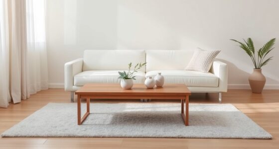
Creating a cohesive color palette not only enhances your home's visual flow but also makes decorating decisions much simpler and more enjoyable. By selecting a well-defined color palette, you can create a harmonious atmosphere that ties your spaces together beautifully. This approach reduces confusion, allowing you to focus on what truly matters in your decor.
Neutral tones serve as an excellent foundation, providing versatility and balance. They allow you to experiment with various accent colors, adding personality without overwhelming the overall aesthetic. For instance, pairing soft grays or warm beiges with vibrant blues or sunny yellows can create a stunning contrast that draws the eye.
Using color palettes also influences the mood of your home. Warmer shades can invite coziness, while cooler tones evoke tranquility. When you know the emotional impact of different colors, you can make intentional decorating decisions that enhance your living environment.
In the long run, a thoughtfully curated color scheme saves you time and money by minimizing impulse buys. Everything in your home will work together seamlessly, creating an inviting space that feels both cohesive and welcoming.
Popular August Color Trends
As you explore popular August color trends, you'll notice a shift toward warm hues that evoke the cozy vibes of late summer.
Earthy tones can create a soothing atmosphere, while bold accent colors add that striking touch you might be looking for.
Let's unpack how these elements can transform your space this season.
Trending Warm Hues
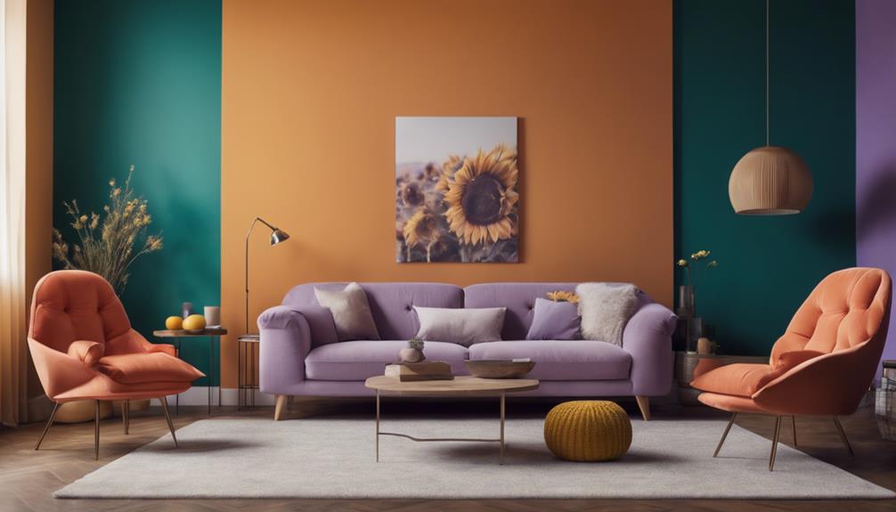
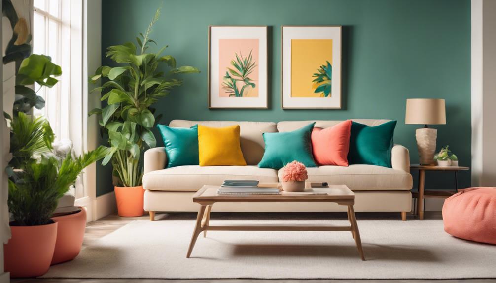
August brings a vibrant array of trending warm hues, like terracotta, mustard yellow, and warm taupe, that can transform your home into a cozy retreat. These warm hues evoke the essence of late summer and can enhance the ambiance of your living spaces, creating inviting environments that encourage relaxation and comfort.
When you incorporate these color choices into your decor, whether through soft furnishings or wall colors, you not only stimulate positive emotions but also boost your overall mood. Pairing warm tones with neutral shades provides a balanced approach, allowing for bold accents without overwhelming your space.
To achieve a unified look, consider utilizing a cohesive palette of warm colors throughout your home. This strategy creates a seamless flow from room to room, enhancing visual appeal and harmony in your decor.
Inviting Earthy Tones
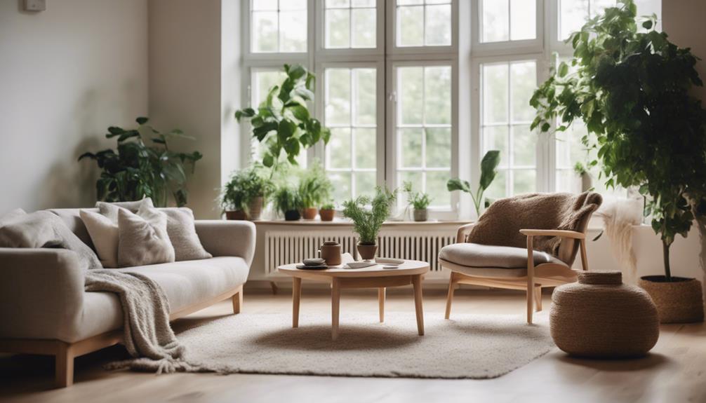
Inviting earthy tones like warm taupes, soft greens, and muted blues bring a calming influence to your home, beautifully complementing the vibrant warm hues of late summer. These colors create a peaceful atmosphere, perfect for spaces where relaxation and connection to nature are essential. By incorporating earthy tones, you'll evoke feelings of warmth and comfort, making your living areas more inviting.
Mixing these hues with neutral shades helps you achieve a cohesive color palette that flows seamlessly throughout your home. This versatility allows you to design a space that feels connected and harmonious. As August rolls in, these earthy colors resonate with the cozy shades of the season, enhancing the overall ambiance of your interiors.
For added dimension, consider pairing your earthy tones with vibrant accent colors. This combination not only enlivens your decor but also highlights the natural beauty of your chosen palette. Additionally, incorporating natural materials and textures alongside these colors will further enhance the inviting atmosphere, making your home a true reflection of the season's charm.
Embrace earthy tones this August, and transform your living space into a serene retreat.
Bold Accent Colors
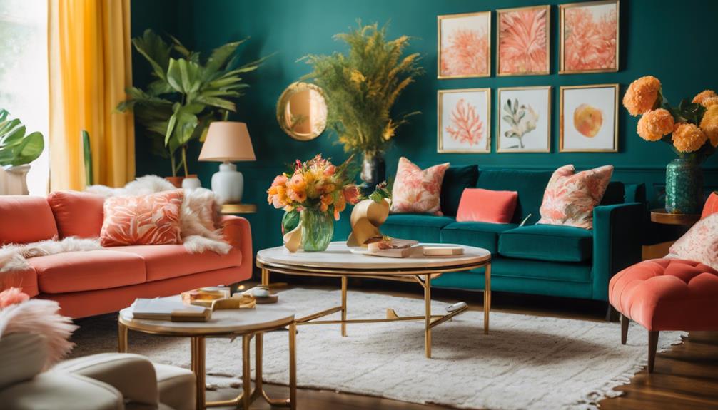
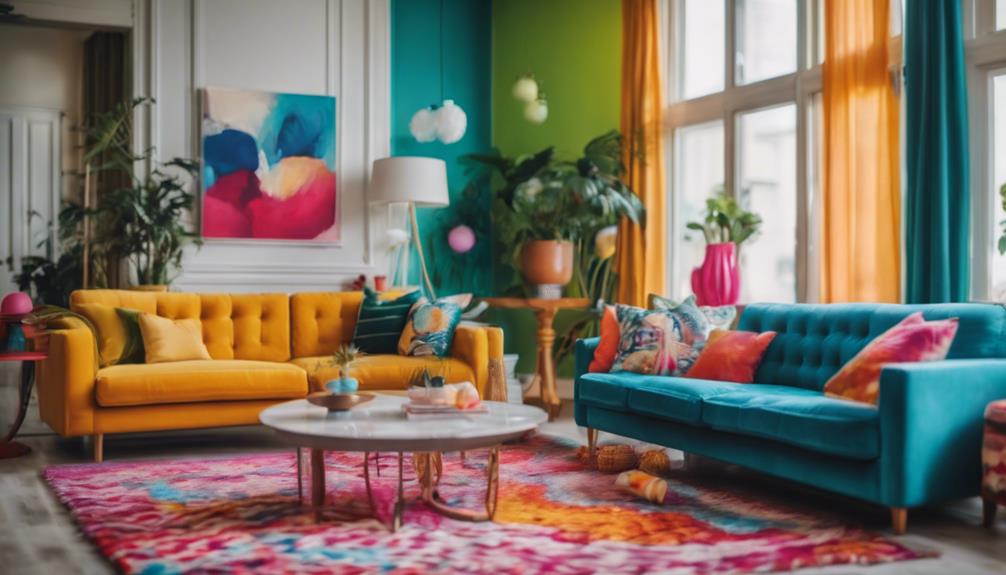
Bold accent colors breathe life into your home, creating a dynamic atmosphere that energizes any space. This August, consider incorporating vibrant shades like deep greens and bright pinks to invigorate your rooms. Using bold accent colors against neutral backdrops can create a striking contrast, enhancing the overall aesthetic appeal.
Here's a quick guide to help you choose the right bold accent colors:
| Color | Effect |
|---|---|
| Deep Green | Invokes tranquility and connection to nature |
| Bright Pink | Evokes creativity and playfulness |
| Navy Blue | Adds sophistication and calmness |
| Burnt Orange | Brings warmth and enthusiasm |
Accent colors are best used in small doses—think accent walls or decorative accessories. This approach prevents overwhelming your space while still making a statement. Color psychology supports this trend; vibrant tones can evoke feelings of energy and creativity, making them perfect for social or creative areas. So, don't shy away from bold accent colors this month—embrace them and watch your home transform!
Choosing Colors for Different Rooms
When choosing colors for different rooms, think about how each hue can influence the mood and functionality of the space.
In your main living areas, opt for warm tones like soft oranges or yellows. These colors can add an inviting atmosphere, encouraging social interaction and comfort.
For kitchens, consider bright colors such as sunny yellows or vibrant reds. These shades stimulate energy and enhance appetite, promoting a cheerful environment.
When it comes to bedrooms, calming colors like cool blues or soft greens are ideal. They promote relaxation and restful sleep, creating a serene space for you to unwind.
In bathrooms, soothing hues like light grays or gentle aquas evoke a spa-like atmosphere, enhancing feelings of cleanliness and tranquility.
If you're dealing with smaller spaces, such as hallways or entryways, using lighter shades like whites or soft pastels can create an illusion of openness. This helps these areas feel more spacious and airy.
Warm Color Combinations
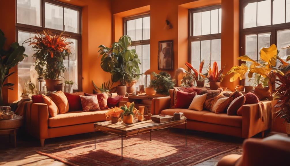
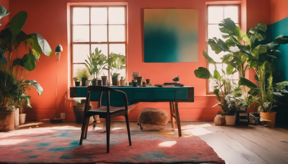
Warm color combinations, like rich oranges and deep reds, create a cozy atmosphere that draws people in and encourages connection. These warm colors evoke feelings of comfort, making them perfect for living spaces and dining areas where you want to foster interaction. For instance, pairing a soft peach with a bold coral can energize a room while maintaining its inviting nature.
Consider adding accent walls painted in warm hues like terracotta or mustard. These can add depth and interest to your space without overwhelming it, especially when balanced with neutral furnishings. It's a great way to make a statement while keeping the overall vibe comfortable.
Don't forget to incorporate warm colors into your home decor through textiles and accessories. Cushions, throws, and artwork in warm tones allow for easy updates to your seasonal decor while ensuring a cohesive look throughout your home.
Cool and Calming Shades
When you choose cool and calming shades like soft blues and greens, you invite tranquility into your space.
These colors not only create a peaceful atmosphere but also make smaller rooms feel more open and airy.
Let's explore how these hues can enhance your home's relaxation areas and promote well-being.
Effects of Cool Colors
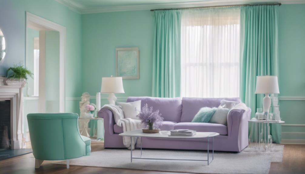
Embracing cool colors like blues, greens, and purples can transform your living space into a calming oasis that promotes relaxation and reduces stress. These soothing shades are perfect for creating an inviting atmosphere in your home, making it feel more spacious and open, especially in smaller rooms or areas lacking natural light.
Incorporating cool colors into your interior design can also enhance your focus and productivity, making them ideal for workspaces and study areas. For bedrooms, these hues have been linked to improved sleep quality, helping create a serene environment conducive to rest.
Here's a quick overview of the effects of cool colors:
| Color | Effect |
|---|---|
| Blues | Promotes tranquility |
| Greens | Enhances focus |
| Purples | Evokes serenity |
Ideal Spaces for Calmness
How can you create ideal spaces for calmness using cool and calming shades?
By incorporating cool colors like soft blues and gentle greens, you can evoke tranquility and relaxation in your home. These hues are perfect for areas designed for unwinding, such as bedrooms and meditation spaces.
To enhance the calming effects, consider the following tips:
- Use lighter shades: In small rooms, lighter colors create an illusion of openness, enhancing the overall sense of calm.
- Incorporate accent walls: Choose cool tones like mint or aqua for an accent wall, introducing a rejuvenating focal point without overwhelming the space.
Accent Colors to Enhance Spaces
Accent colors can instantly elevate your space, adding depth and visual interest that brings your decor to life. By incorporating accent colors in small doses, like decorative pillows or artwork, you can introduce a pop of color that truly transforms your environment.
Consider using complementary colors alongside your primary palette; for example, pairing a soft blue with vibrant orange can create a striking contrast that enhances your overall aesthetic. You can also apply accent colors to trims, doors, or furniture, effectively framing and highlighting architectural features to make them focal points within the room.
The strategic use of these colors can even influence the mood of your space. Warm colors like yellows and reds energize a room, while cool colors such as greens and blues promote relaxation.
To guarantee the best results, test accent colors with paint swatches in natural light. This will help you visualize how these hues interact with your existing decor and how they can create subtle pops throughout the day.
Embrace the power of accent colors to breathe new life into your home and create a space that reflects your style and personality.
Tips for Testing Paint Colors
Testing paint colors effectively requires careful thought of natural light, as it can dramatically alter the way hues appear in your space. To guarantee you choose colors that truly fit your vision, follow these essential tips:
- Use large sample swatches (at least 12×12 inches) to paint sections on your wall, giving you a better view of how the color interacts with your surroundings.
- Observe the paint colors at different times of the day. This will help you understand how the hues shift with varying light conditions, especially with shades of blue.
When you test paint colors, don't forget to take into account the finish as well. Matte finishes absorb light, while glossy options reflect it, which can greatly affect the overall appearance.
Common Color Mistakes to Avoid
Avoiding common color mistakes can greatly enhance your home's aesthetic and create a more inviting atmosphere. Start by making certain your color scheme flows smoothly throughout your space. Ignoring the changes between rooms can lead to a disjointed look. Choose one dominant color and use different shades to maintain harmony.
Another mistake is overusing bold colors. While they can add personality, too many can create chaos rather than comfort. It's crucial to balance bold hues with softer tones to keep your space inviting.
Neglecting to account for natural light can also skew your color perception. Colors may look drastically different in various lighting, affecting the overall mood. Finally, don't forget the impact of finish—matte and glossy surfaces can alter your color's appearance dramatically.
Here's a quick reference table to help you avoid these pitfalls:
| Mistake | Solution |
|---|---|
| Overusing bold colors | Balance with softer tones |
| Ignoring room transitions | Make certain of a cohesive flow |
| Neglecting natural light | Test colors in different lighting |
Engaging With Your Community
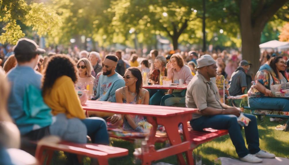
Engaging with your community around color trends not only sparks creativity but also fosters a sense of belonging among participants. By actively participating in discussions and sharing your ideas, you contribute to a vibrant exchange that can elevate your decorating projects.
Here are some ways to enhance your community engagement:
- Participate in challenges: Join initiatives like the August Color Trends Challenge to showcase your creativity and connect with fellow enthusiasts.
- Utilize social media: Platforms like Instagram and Pinterest allow you to share your creations, receive feedback, and discuss innovative color combinations in real-time.
When you engage with your community, you not only gain confidence through positive feedback but also inspire others. Your shared experiences and insights can lead to exciting new color trends that everyone can enjoy.
How Can I Use Texture Tips to Enhance the August Color Palettes in My Home?
Enhance the August color palettes in your home by using texture tips to transform any room with texture. Incorporate natural materials like wood or stone to add depth and warmth. Experiment with textiles such as velvet or linen to create a cozy and inviting atmosphere. Texture can add visual interest and elevate your interior design.
Conclusion
As you transform your home with these vibrant August color palettes, remember that a little splash of creativity can go a long way.
Embrace the warmth of sunny hues or the serenity of cool shades—whatever speaks to your soul.
By steering clear of common color pitfalls and taking the time to test your choices, you're bound to create a space that feels just right.
So, roll up your sleeves and let your personality shine through every brushstroke!