
Revamp your home this August with vibrant color palettes that celebrate the warmth of summer and shift into cozy autumn vibes. Start by embracing warm tones like burnt reds and yellows, which energize your space. Incorporate accents in coral for a lively touch. Limit your palette to 3-5 colors for a cohesive look, and don't forget to play with neutrals to balance everything out. Small updates like new throw pillows or seasonal blankets can make a big difference. Keep exploring color combinations that work for you, and you'll find plenty of ideas and tips to brighten your home atmosphere.
Key Takeaways
- Embrace warm tones like burnt reds and oranges to energize your space and reflect late summer nostalgia.
- Incorporate accent colors such as coral and yellow for a vibrant and inviting atmosphere in your home.
- Use earthy tones to connect your indoor decor with the changing outdoor fall foliage for a harmonious look.
- Rotate small decor items, like throw pillows and seasonal blankets, to refresh your aesthetic without extensive renovations.
Embrace the August Vibes
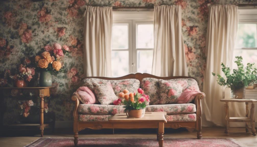
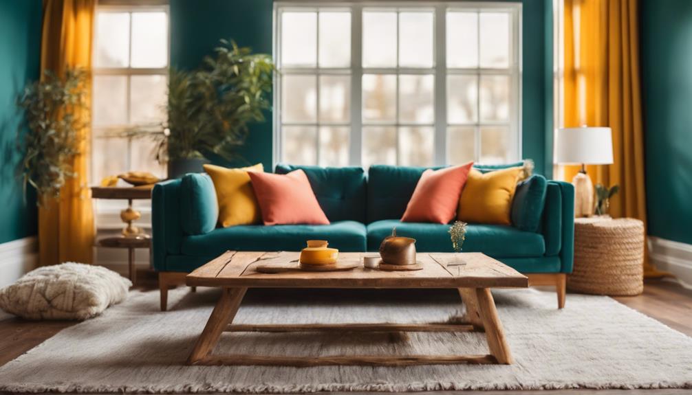
As August rolls in, it's the perfect moment to embrace color palettes that mirror the shift from summer's vibrancy to autumn's warmth. This month, consider integrating warm tones like burnt reds and oranges into your decor. These hues not only energize your space but also reflect the nostalgic essence of late summer, creating a cozy atmosphere.
Incorporate accent colors such as coral and yellow to highlight your primary color palette. These bright touches can invigorate your home, inviting a sense of comfort and joy.
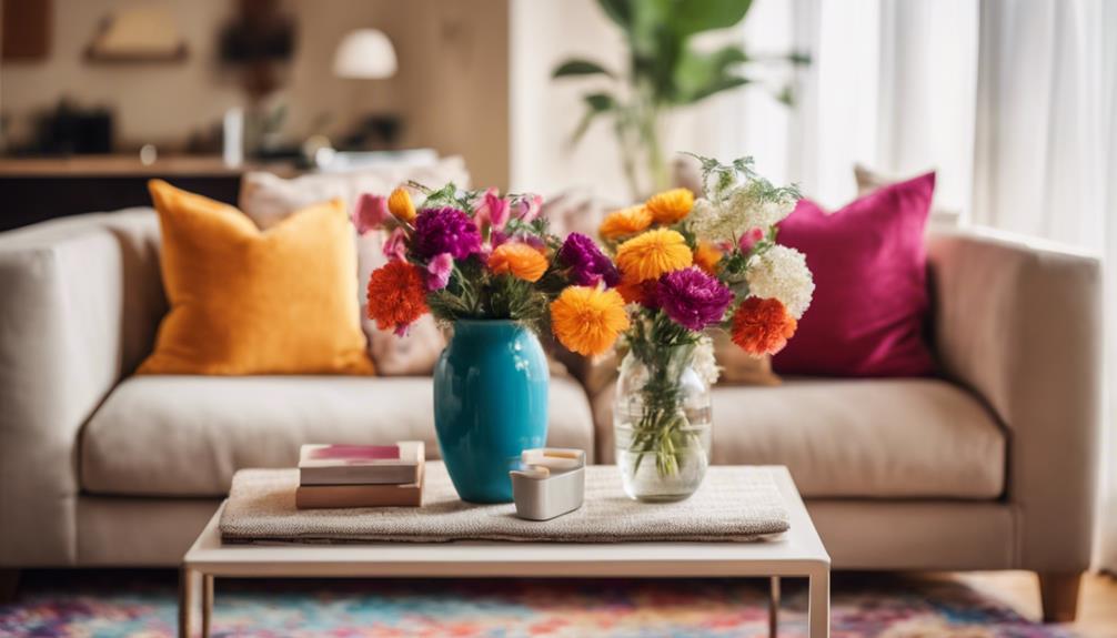
Think about small decor changes that can make a big impact—switching out throw pillows or draping seasonal blankets can refresh your aesthetic effortlessly.
Selecting Your Key Colors
When selecting your key colors, start by identifying dominant shades that resonate with your style.
Consider seasonal influences that can inspire your choices and create a fresh atmosphere.
Identify Dominant Colors
Identifying dominant colors in your home starts with observing the standout hues in your existing furniture, flooring, and decor. Look closely at the colors that catch your eye and think about how they can form your color scheme. If you have a favorite piece of furniture, use its color as a foundation for your palette.
You can also take inspiration from your wardrobe. The colors you love to wear often reflect your personal style, so consider how those hues might translate into your living space. Once you've identified some key colors, utilize a color wheel to explore complementary colors that can enhance your overall look.
Aim to create a cohesive palette by limiting your choices to 3-5 dominant colors. This approach allows for visual harmony while giving you room to play with accent colors in smaller accessories.
Consider Seasonal Influences
August invites you to embrace warm tones like burnt red and orange, reflecting the seasonal change from summer to autumn in your home decor. Choosing key colors for this month can enhance the warmth and vibrancy of your spaces, making them feel inviting and seasonal.
Focus on creating a well-curated palette of 3 to 5 colors that resonate with the current season.
Consider incorporating hues that capture summer's energy, such as coral and yellow, to infuse brightness into your living areas. These colors work beautifully when combined with the richer tones of autumn, creating a balanced look that shifts seamlessly.
Small decor changes can make a significant impact; think about adding throw pillows or accent pieces in your selected colors. This approach allows you to refresh your home without overwhelming it, while also aligning your decor with the themes of August.
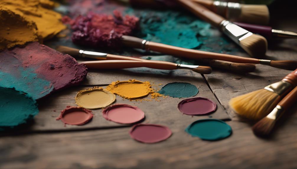
Test Color Combinations
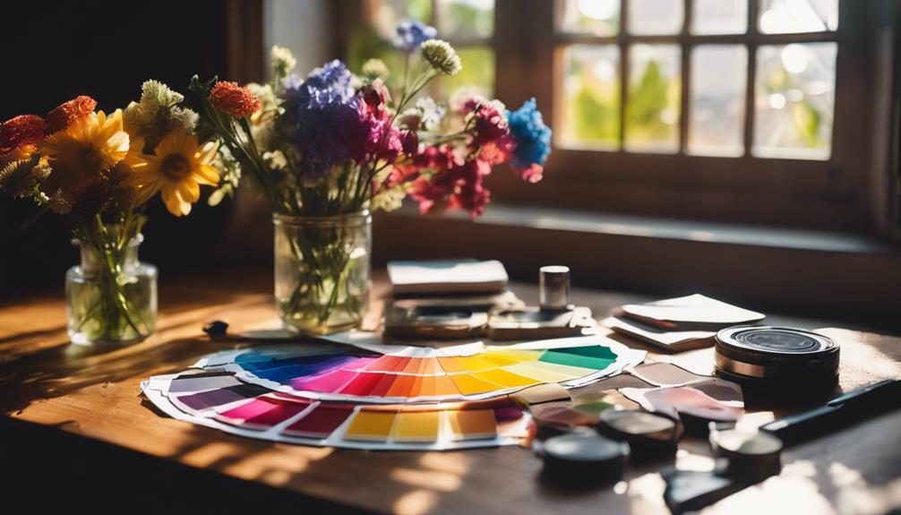
Testing color combinations is essential to finding the perfect key colors that resonate with your style and enhance your home's ambiance. Start by choosing 3 to 5 shades that reflect the mood you want to create. A neutral base color works well to provide versatility, while bolder shades can serve as eye-catching accents, adding personality to your living room.
To visualize your options, use color palette generators like Coolors or Pantone, which allow you to experiment with different paint color combinations. Once you have a few favorites, it's time to test them out. Paint large sample squares on your walls, and observe how each color looks in various lighting throughout the day. This hands-on approach will help you see how the colors interact with existing elements in your space.
Don't forget the psychological effects of color; warm tones can create an inviting atmosphere, while cooler tones promote tranquility. By carefully testing and selecting your key colors, you'll guarantee a cohesive and harmonious look that enhances your home's overall aesthetic.
Complementary Color Choices
When you think about using complementary colors, focus on selecting accent colors that really pop in your space.
Balancing warm and cool tones can create a dynamic visual experience, making your home feel more inviting.
Selecting Accent Colors
Choosing complementary colors for your accent palette can create a vibrant visual contrast that instantly enhances your space. Look for colors located opposite each other on the color wheel; this pairing adds energy and interest to your room.
When selecting your accent colors, consider incorporating them into smaller decor items, like throw pillows or artwork. This approach makes a bold statement without overwhelming your overall design.
To achieve a cohesive look, limit your palette to 3 to 5 colors. One or two of these should be neutral colors, providing a versatile backdrop that allows your accent colors to pop.
Testing these accent colors against your main color palette in different lighting conditions is essential. This way, you can guarantee they harmonize well throughout the day, adapting to the changing light.
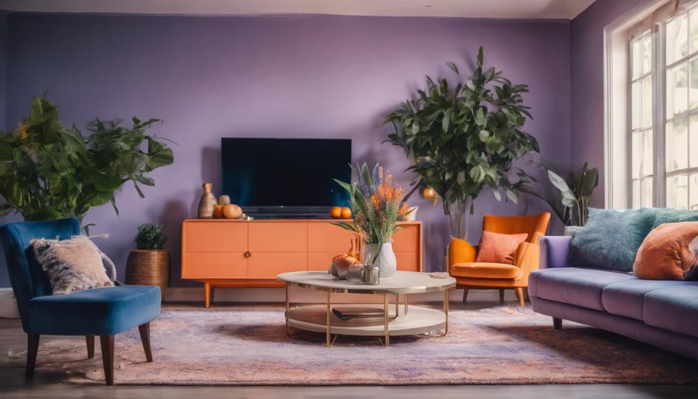
Balancing Warm and Cool
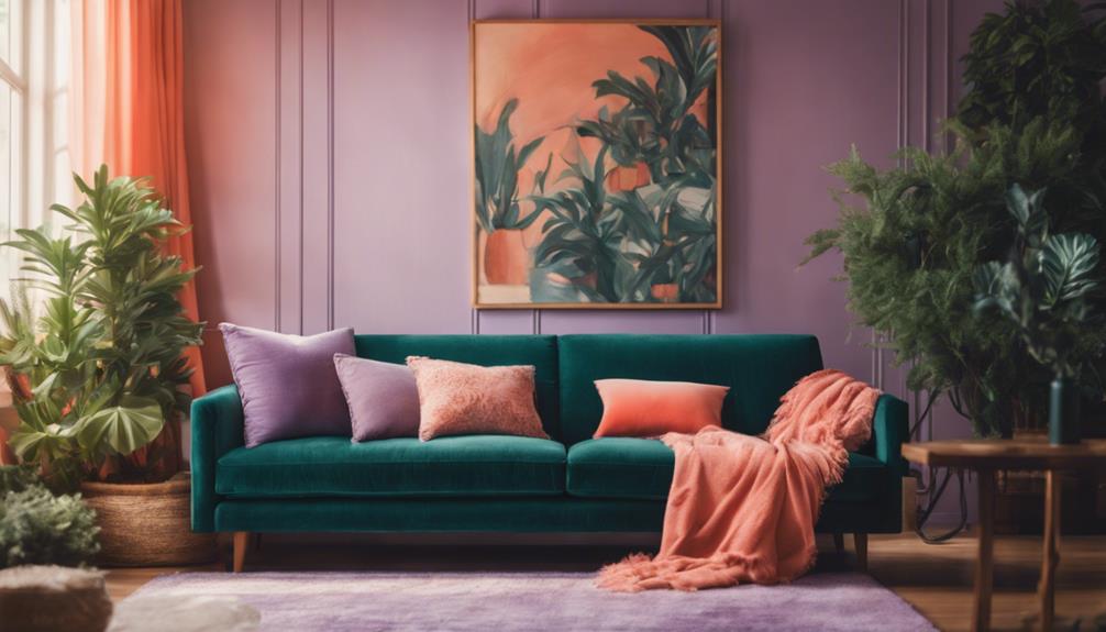
Balancing warm and cool colors in your home can transform the atmosphere, creating a visually engaging and inviting space. Warm colors, like burnt orange and rust, bring energy and comfort, while cool colors, such as deep blue and green, promote calmness and tranquility. By thoughtfully combining these color types, you can enhance the overall ambiance of each room.
Using complementary colors—those opposite each other on the color wheel—can lead to striking contrasts that energize your space. For example, pairing a warm yellow with a cool purple can create a dynamic feel that highlights key design elements. To achieve a balanced look, incorporate neutrals as a base; they provide a grounding effect and allow flexibility in your decor choices.
Don't forget to test your color combinations in natural light, as different lighting can greatly affect how warm and cool tones interact. This step guarantees that your chosen palette feels harmonious and inviting, no matter the time of day.
Creating Visual Harmony
Creating visual harmony in your home involves using complementary colors that not only contrast beautifully but also enhance the overall aesthetic of your space. These colors are located opposite each other on the color wheel, such as navy blue paired with warm orange. This striking contrast adds visual interest and draws attention to key focal points in the room.
When selecting complementary colors, it's crucial to take into account their intensity and saturation levels. A well-balanced approach prevents the space from feeling overwhelming while still keeping it dynamic. You'll want to strike a balance that allows each color to shine without overpowering the other.
Accessories and textiles in complementary colors can effectively tie various elements together, ensuring a cohesive look throughout your home. Think throw pillows, rugs, or artwork that incorporate these hues to create a seamless design.
Experimenting with complementary color schemes not only adds a unique touch to your decor but also reflects your personal style. So, don't hesitate to explore these vibrant combinations and transform your living space into a harmonious haven that showcases your creativity.
Seasonal Color Trends
As August rolls in, warm hues like burnt red and orange become essential for transforming your home, reflecting the cozy shift from summer to autumn. Embracing these seasonal colors not only updates your space but also evokes feelings of warmth and comfort, making your home a welcoming retreat.
You can easily incorporate these rich tones through accessories. Consider changing out your throw pillows and blankets to feature those inviting warm hues. A few strategically placed pillows can instantly elevate a room's ambiance, while a cozy throw can add texture and warmth to your sofa or chair.
The natural changes happening outside—like the beginning of fall foliage—can inspire your decor choices. Think earthy tones that resonate with the season, creating a harmonious connection between your indoor space and the outdoors.
Don't underestimate the power of small changes, either. Rotating artwork or swapping out accent pieces can greatly impact the overall vibe of your home. By embracing August's vibrant color trends, you can create an inviting atmosphere that perfectly captures the essence of the season.
Creating a Cohesive Look
To achieve a cohesive look in your home, select a color palette of 3 to 5 colors that not only harmonize but also reflect your personal style. Start by utilizing the color wheel to identify analogous or complementary colors, guaranteeing a seamless visual flow between rooms. By incorporating neutral tones as your base, you create a balanced backdrop that allows for the introduction of bold accent colors without overwhelming the space.
Here are some tips to maintain that cohesive look:
- Choose furniture and textiles that incorporate your selected color palette.
- Use artwork that features the same colors to tie different areas together.
- Keep larger decor items in neutral tones to anchor the design.
- Refresh seasonal accents while staying true to your core color palette.
Revamping With Accessories
Revamping your space with carefully chosen accessories can breathe new life into any room while showcasing your unique style. By accessorizing with vibrant colors like coral, burnt red, and shades of yellow and orange, you can effortlessly convert your home into a warm, inviting space for August.
Consider incorporating a mix of seasonal colors in your blanket throws and decorative items. Here's a quick reference to inspire your accessorizing journey:
| Accessory Type | Suggested Colors |
|---|---|
| Throw Pillows | Coral, Burnt Red |
| Bed Linens & Curtains | Light Yellow, Orange |
| Decorative Accents | Bright Blue, Rust |
Small accents, like vases or artwork, can create focal points that tie your color scheme together. Additionally, using culturally resonant colors and patterns adds depth, making your decor feel personalized. By rotating accessories, you infuse energy into your home without the need for major renovations. Embrace these ideas to create an ambiance that reflects your style and the vibrant themes of August!
Tools for Color Selection
Finding the right colors for your home can be a breeze with the help of various digital tools and apps designed for color selection. These resources simplify the process and can inspire you to create stunning color schemes that reflect your style.
Here are some essential tools you should consider:
- Color Palette Generators: Use apps like Coolors and Pantone to visualize and curate color combinations effortlessly.
- Canva: Extract colors from your favorite photos to create a personalized color scheme that matches your existing decor.
- Color Hunt: Discover curated color palettes that provide guidance and inspiration for cohesive designs.
- Paint Swatches: Always grab sample swatches from your local hardware store to see how colors look in natural light before making a commitment.
Conclusion
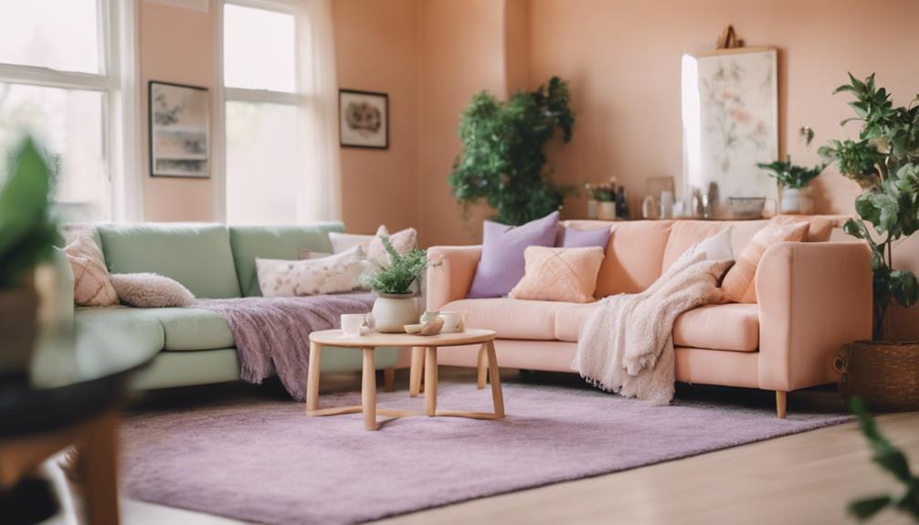
Revamping your home with these amazing August color palettes can transform your space into a vibrant oasis. Create a warm and inviting atmosphere with shades of golden yellow and earthy orange, or opt for a cool and calming vibe with serene shades of blue and green. For a modern touch, consider incorporating stylish bathroom paint colors such as blush pink or deep navy. Whether you want to revamp a single room or your entire home, these August color palettes will add a fresh and lively aesthetic to your living space.
Did you know that incorporating bold colors can increase your mood by 20%? So why not take the plunge and experiment with these hues?
Remember, it's all about creating a cohesive look that reflects your personality.
Grab some accessories, get inspired, and let your home shine with the energy of August. You won't regret it!